2018 Worldwide CO2 emissions per capita and country
Nov. 18, 2019, 5:47 p.m.
Creative Commons Attribution-ShareAlike (CC BY-SA)
Tom Schulz
English
en.wikipedia.org/wiki/List_of_countries_by_carbon_dioxide_emissions_per_capita#/media/File:2018_AQAL_Group_variwide_chart_%22Worldwide_Co2_emissions%22.jpg
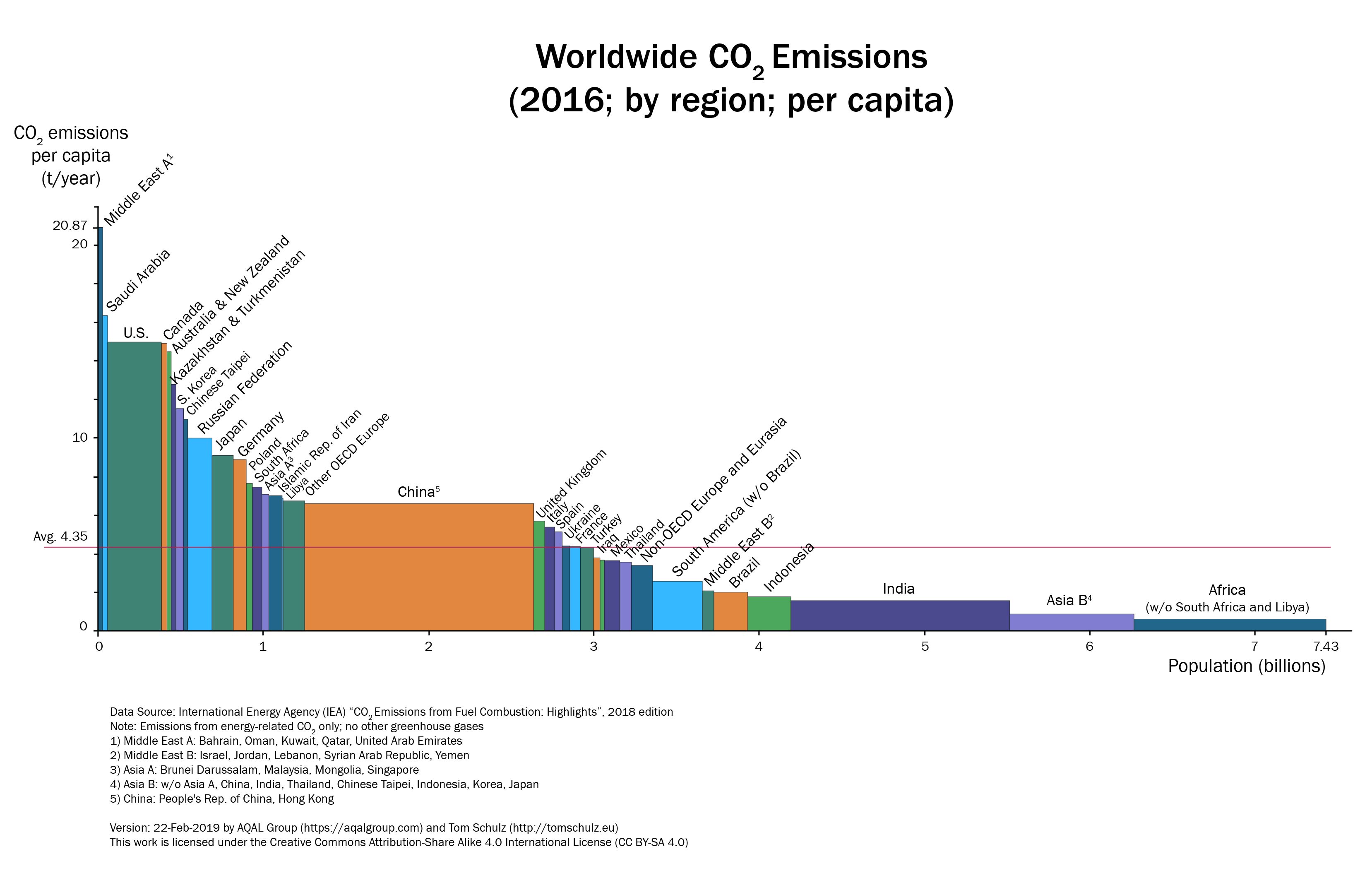
Tom Schulz developed the variwide chart "Worldwide CO2 Emissions". The total CO2 emissions of a region is represented through a rectangular area. The height of each rectangle is proportional to the CO2 emissions per capita and the width is proportional to the population of the represented region. The regions are sorted by CO2 emissions per capita, from the highest to the lowest. The data comes from the International Energy Agency, was published in 2018 and shows the 2016 status. It becomes obvious that emissions vary widely from one country to the next with 30.8 t per capita in Qatar to 16.2 t per capita in the U.S., 6.6 t per capita in China, all the way down to Africa with 0.95 t per capita. The world average is 4.35 t per capita. Most industrialized nations range between 4 t and 15 t CO2 emissions per capita. Through this chart, it becomes obvious that the earth would not be able to absorb additional CO2 emissions to make room for additional developing nations like India and continents like Africa to “catch up” by increasing their per capita emissions to the current average. Never mind that developed countries are to be made responsible for the current misery, the fate of the earth is currently decided by what occurs in China, India, Africa and other developing countries from now on.
CC BY-SA - Creative Commons Attribution-ShareAlike